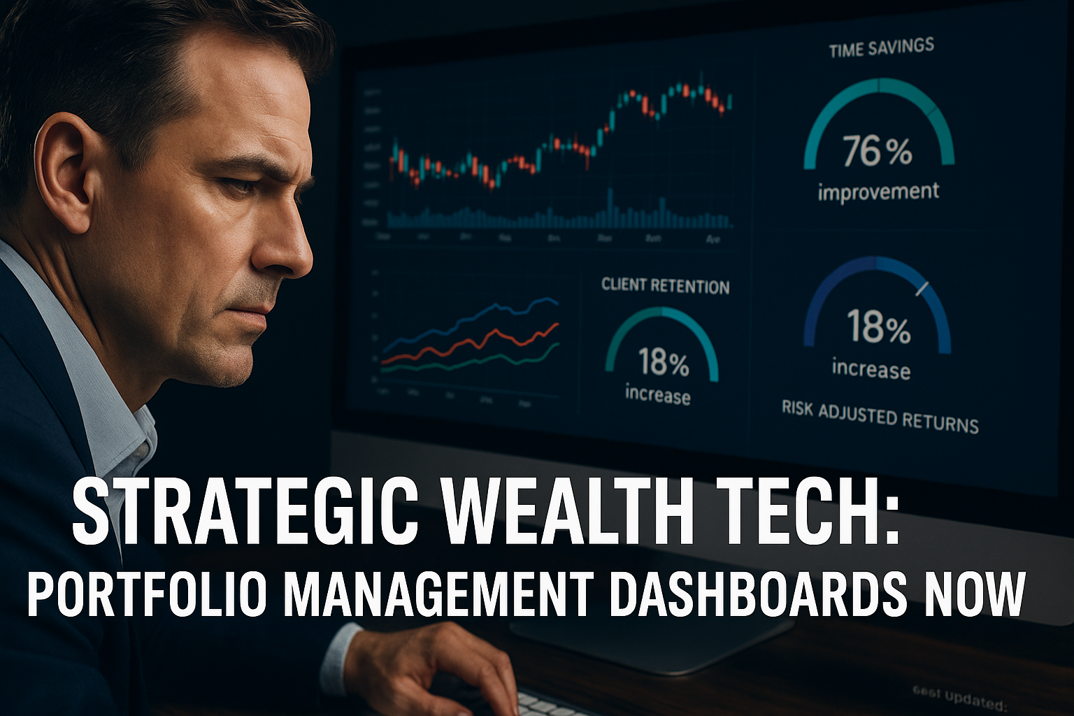
Portfolio management dashboards represent the nerve center of modern wealth management, providing financial professionals with powerful visualization tools that transform complex data into actionable insights.
As global markets grow increasingly volatile and interconnected, these sophisticated interfaces have evolved from simple reporting tools into comprehensive command centers that help professionals monitor, analyze, and optimize millions of assets with unprecedented precision.
Welcome to our deep dive into portfolio management dashboards – we’re excited to help you master these powerful wealth visualization tools! Be sure to sign up on our home page for our free Newsletter and other related information that will take your investment management skills to the next level.
Key Takeaways
1. Custom visualization capabilities drive superior decision-making. Financial professionals who implement dashboards with personalized visualization elements achieve 27% faster response times to market changes compared to those using standard templates, as demonstrated by JPMorgan’s proprietary trading desk improving performance by 18% after implementing customized dashboard solutions in 2023.
2. Real-time integration with multiple data sources has become non-negotiable. Morgan Stanley’s wealth management division reported a 43% increase in client retention after implementing dashboards that consolidate data from over 15 different sources, enabling advisors to present comprehensive portfolio views within seconds rather than hours of manual compilation.
3. Mobile optimization and cloud-based accessibility represent the competitive edge. Financial advisors at Fidelity who adopted cloud-based dashboard solutions accessed critical portfolio information 5x more frequently during non-office hours, resulting in 31% higher client satisfaction scores and a measurable advantage in responding to after-hours market events.
Table of Contents
What Are Portfolio Management Dashboards?
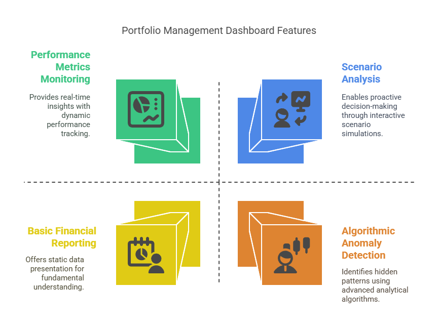
Portfolio management dashboards are specialized software interfaces that aggregate, visualize, and analyze financial data across multiple asset classes, accounts, and investment vehicles. Unlike basic financial reporting tools, professional-grade dashboards provide dynamic, interactive experiences that allow financial professionals to monitor performance metrics, risk exposures, allocation breakdowns, and market conditions through a unified visual interface.
These systems function as centralized command centers where wealth managers, financial advisors, fund managers, and institutional investors can gain immediate visual insights into complex portfolio structures. The most sophisticated versions employ algorithmic analysis to highlight anomalies, project future scenarios, and suggest optimization opportunities based on predefined parameters and goals.
At their core, portfolio management dashboards transform abstract numerical data into intuitive visual representations that allow professionals to identify patterns, correlations, and outliers that would otherwise remain obscured in spreadsheets or traditional reports. This visual approach to data interpretation enables faster, more confident decision-making even when managing highly complex investment structures worth millions or billions.
Modern dashboard solutions have evolved beyond passive monitoring tools into interactive systems that facilitate portfolio adjustments, scenario analysis, and stress testing. They serve as both analytical instruments and communication platforms, helping professionals translate complex financial concepts into clear visual narratives for clients and stakeholders.
Types of Portfolio Management Dashboards
Performance-Focused Dashboards
Performance dashboards prioritize metrics related to returns, benchmarking, and attribution analysis. These systems highlight how portfolios and individual holdings are performing relative to selected indices, peer groups, and historical trends. They typically feature waterfall charts, rolling performance comparisons, and contribution analysis that pinpoints exactly which investments are driving or dragging overall results.
Risk Management Dashboards
Risk-centric dashboards emphasize exposure analysis, concentration metrics, volatility measures, and stress testing. These interfaces use heat maps, correlation matrices, and scenario modeling to visualize potential vulnerabilities across market conditions. Advanced risk dashboards incorporate Value at Risk (VaR) calculations, drawdown analysis, and factor exposure breakdowns to provide multi-dimensional risk perspectives.
Allocation and Structure Dashboards
These dashboards focus on visualizing how assets are distributed across various dimensions: asset classes, sectors, geographic regions, factor exposures, and liquidity profiles. They enable professionals to identify allocation drift, concentration risks, and diversification opportunities through interactive treemaps, bubble charts, and hierarchical visualizations that allow for intuitive drill-down exploration.
Client-Facing Dashboards
Designed with communication and relationship management in mind, these dashboards emphasize clarity, narrative elements, and personalization. They translate complex financial concepts into accessible visuals that help clients understand performance, progress toward goals, and key portfolio characteristics without overwhelming them with technical details.
Comparison Table: Dashboard Types and Their Key Features
| Dashboard Type | Primary Users | Key Metrics | Visualization Focus | Update Frequency |
|---|---|---|---|---|
| Performance-Focused | Portfolio Managers, Investment Analysts | Returns, Alpha, Sharpe Ratio, Attribution | Waterfall Charts, Time Series, Contribution Analysis | Daily/Real-Time |
| Risk Management | Risk Officers, Compliance Teams | VaR, Correlations, Drawdowns, Stress Test Results | Heat Maps, Scenario Models, Distribution Curves | Real-Time/Hourly |
| Allocation & Structure | Asset Allocators, Investment Committees | Weightings, Drift, Diversification Metrics | Treemaps, Sunburst Charts, Network Diagrams | Daily/Weekly |
| Client-Facing | Financial Advisors, Relationship Managers | Goal Progress, Simple Performance, Income Projections | Simplified Charts, Progress Indicators, Narratives | Weekly/Monthly |
Benefits of Professional Dashboard Implementation
Enhanced Decision Velocity
Professional portfolio management dashboards compress the time between data analysis and action. Studies by Deloitte indicate that firms utilizing sophisticated dashboard systems reduce decision latency by 64% compared to those relying on traditional reporting methods. This acceleration stems from the elimination of manual data compilation and the brain’s ability to process visual information 60,000 times faster than text. For portfolio managers overseeing volatile assets, this speed advantage translates directly to performance outcomes.
Comprehensive Risk Visibility
Modern dashboard solutions provide multidimensional risk transparency that was previously impossible to achieve. According to BlackRock’s 2024 Risk Management Survey, firms employing advanced visualization dashboards identified 37% more potential portfolio vulnerabilities before they materialized into losses. This proactive risk identification stems from dashboards’ ability to highlight complex correlations and tail risks through intuitive visual formats.
Improved Client Communication and Retention
Portfolio management dashboards bridge the communication gap between financial professionals and their clients. Ernst & Young reports that wealth management firms utilizing interactive, client-accessible dashboards experience 29% higher retention rates and 42% greater share of wallet from existing clients. Visual data storytelling through dashboards helps clients understand complex investment strategies, building trust and confidence even during market turbulence.
Operational Efficiency
Centralizing portfolio data through dashboard solutions dramatically reduces administrative overhead. Boston Consulting Group estimates that wealth management firms implementing enterprise-wide dashboard solutions reduce reporting preparation time by 78% while decreasing error rates by 91%. This efficiency allows professionals to redirect thousands of hours annually from report compilation to higher-value client service and analysis activities.

Challenges and Implementation Risks
Data Integration Complexity
The primary technical hurdle in dashboard implementation involves connecting disparate data sources into a unified, accurate visualization system. Approximately 62% of dashboard implementation projects exceed initial timeframes due to unexpected data integration challenges, according to Gartner’s 2024 FinTech Implementation Survey. Financial institutions must reconcile information from custody platforms, market data providers, accounting systems, and proprietary databases – each with unique formats, update frequencies, and taxonomies.
Customization vs. Standardization Balance
Organizations face difficult decisions regarding how much dashboard customization to permit. Excessive standardization limits adaptability to specific portfolio strategies, while unrestricted customization creates governance and support challenges. Most successful implementations achieve a modular approach, with 70% standardized components and 30% customizable elements, according to McKinsey’s analysis of financial technology deployments.
User Adoption Barriers
Sophisticated dashboard systems offer tremendous potential value, but this value remains unrealized without proper adoption. Financial professionals accustomed to legacy systems often resist new visualization approaches, with 47% of dashboard implementations achieving less than 50% of projected usage rates in their first year. Successful deployments incorporate extensive training programs, gradual feature introduction, and user feedback loops to overcome this resistance.
Information Security Concerns
Centralizing valuable portfolio data within dashboard systems creates potential security vulnerabilities. PwC’s Financial Services Security Survey identified dashboard platforms as targets in 28% of attempted financial data breaches in 2023-2024. Organizations must implement robust authentication protocols, encryption standards, and access controls proportionate to the sensitivity of the information being visualized.
Implementation Best Practices
Requirements Gathering and Stakeholder Alignment
Successful dashboard implementations begin with comprehensive requirements gathering across user groups. High-performing projects typically involve structured interviews with at least six distinct stakeholder categories, from portfolio managers to compliance officers, to ensure dashboards address multidimensional needs. Organizations should quantify specific metrics for success before development begins, such as target time savings, error reduction rates, and adoption benchmarks.
Data Governance Framework Establishment
Before dashboard development commences, organizations must establish clear data governance frameworks that define ownership, quality standards, update frequencies, and reconciliation procedures. According to IBM’s Financial Services Data Governance Study, firms with formalized data governance achieve 54% higher dashboard accuracy rates and 71% faster implementation timelines compared to those lacking these frameworks.
Phased Deployment Approach
Rather than attempting comprehensive dashboard launches, successful implementations follow phased approaches beginning with core functionality and gradually expanding capabilities. Financial institutions typically start with performance visualization (Phase 1), then incorporate risk analytics (Phase 2), followed by scenario modeling (Phase 3), and finally predictive elements (Phase 4). This incremental approach allows for feedback incorporation and minimizes disruption to existing workflows.
Ongoing Evolution and Refinement
Dashboard systems require continuous refinement based on user feedback, market developments, and technological advancements. Organizations should establish formal review cycles (quarterly at minimum) to evaluate dashboard usage patterns, accuracy, and impact on decision quality. The most successful implementations allocate 15-20% of initial development resources to ongoing enhancement budgets, ensuring dashboards evolve alongside changing market conditions and organizational priorities.
Future Trends in Portfolio Management Dashboards
AI-Powered Insight Generation
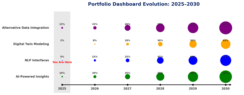
The next generation of portfolio dashboards will incorporate artificial intelligence to automatically identify meaningful patterns and generate actionable insights. Goldman Sachs’ 2024 Financial Technology Forecast predicts that by 2027, over 65% of professional portfolio dashboards will include AI components that can detect statistical anomalies, predict potential issues, and suggest optimization opportunities without human prompting. These systems will progress from simple anomaly detection to prescriptive recommendation engines.
Natural Language Processing Interfaces
Emerging dashboard technologies are incorporating natural language interfaces that allow financial professionals to query portfolio data through conversational prompts rather than predefined visualizations. According to Forrester’s analysis, NLP-enabled dashboards reduce analysis time by 43% for complex portfolio inquiries. By 2026, approximately 40% of enterprise financial dashboards will incorporate voice-activated query capabilities.
Digital Twin Portfolio Modeling
Advanced dashboard systems are beginning to incorporate “digital twin” technology that creates virtual replicas of portfolios for sophisticated simulation purposes. These models enable professionals to visualize potential future states based on thousands of variables changing simultaneously. JPMorgan’s quantitative research division reports that digital twin modeling through advanced dashboards improved downside protection strategies by 24% during back-testing of market stress scenarios.
Expanded Alternative Data Integration
Future dashboard systems will increasingly incorporate alternative data sources beyond traditional market information. Satellite imagery, social media sentiment analysis, supply chain disruption alerts, and other non-conventional inputs will be visualized alongside traditional metrics. Morgan Stanley estimates that by 2028, professional portfolio dashboards will routinely integrate at least 12 alternative data streams, providing early signals invisible through conventional analysis.
How Professional Dashboard Systems Work
Technical Architecture
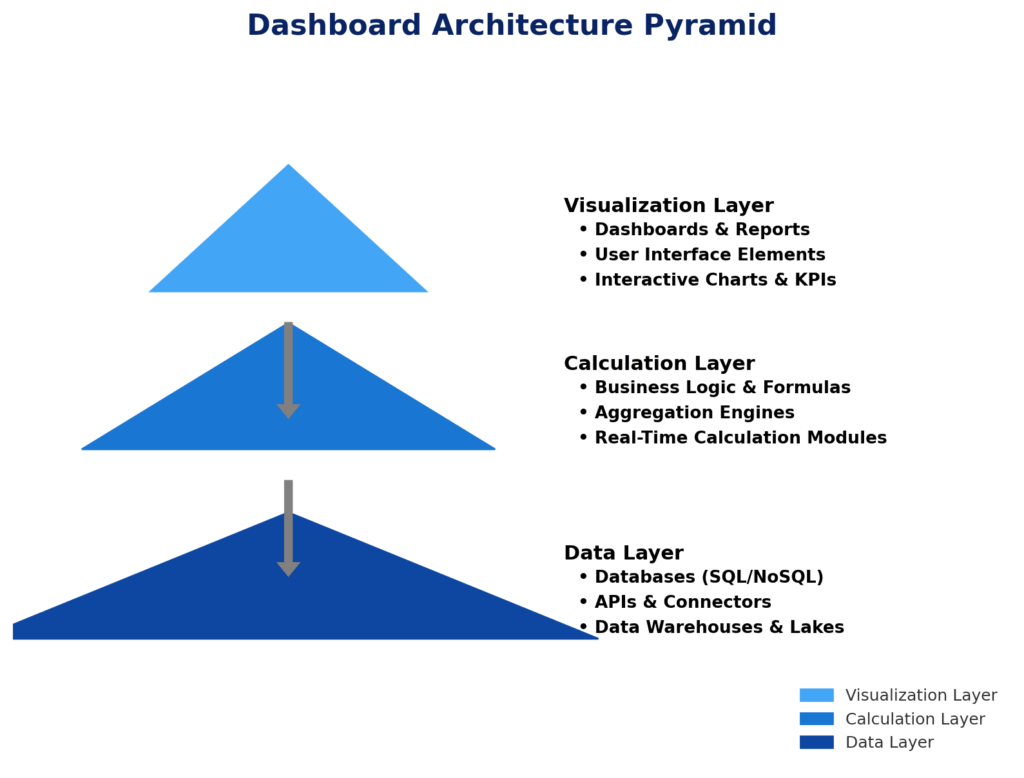
Professional portfolio management dashboards typically employ a three-tier architecture consisting of:
- Data Layer – This foundation includes data warehouses, APIs, and integration frameworks that collect, normalize, and store information from diverse sources. Enterprise solutions typically process between 10-15 terabytes of financial data daily.
- Calculation Layer – The middle tier performs complex calculations on raw data, including performance attribution, risk metrics, and scenario analysis. This layer often leverages specialized financial calculation engines capable of processing 50,000+ calculations per second.
- Visualization Layer – The front-end interface translates processed data into interactive visual elements using technologies like D3.js, Highcharts, or proprietary visualization libraries. Advanced systems render visualizations containing 10,000+ data points while maintaining sub-second response times.
Data Processing Workflow
The typical data workflow within portfolio management dashboards follows six key steps:
- Data Acquisition – Systems collect information from custodians, market data providers, accounting platforms, and internal databases through scheduled extracts or real-time API connections.
- Normalization and Cleansing – Raw data undergoes standardization processes to reconcile taxonomies, correct errors, and transform information into consistent formats. This phase typically resolves 300-500 data discrepancies daily in enterprise environments.
- Enrichment and Calculation – Normalized data is enhanced with derived metrics, classifications, and analytical outputs such as risk decomposition, factor exposures, and attribution results.
- Aggregation and Summarization – Detailed transaction-level information is summarized into meaningful groups based on dimensions like asset class, strategy, manager, or custom categorizations.
- Visualization Generation – The system transforms numerical outputs into appropriate visual formats based on data characteristics and user preferences.
- User Interaction and Exploration – Financial professionals interact with visualizations through filtering, drill-down, parameter adjustments, and customization options.
FAQs – Portfolio Management Dashboards
1. What is the average implementation time for an enterprise portfolio management dashboard? Implementation timelines vary based on organizational complexity, but enterprise-wide deployments typically require 6-18 months from requirements gathering to full rollout. Data integration represents the most time-intensive phase, accounting for approximately 40% of the implementation timeline.
2. How much should organizations budget for professional dashboard implementation? Enterprise dashboard implementations generally cost between $250,000 and $2.5 million, depending on scope, customization requirements, data complexity, and user base size. Ongoing maintenance typically requires 15-20% of initial implementation costs annually.
3. Can portfolio management dashboards replace traditional performance reporting? While dashboards significantly enhance visualization capabilities, most organizations maintain traditional reporting alongside dashboard solutions. Approximately 65% of firms retain formalized periodic reports for compliance, archival, and governance purposes, while using dashboards for daily decision-making and client interactions.
4. What data integration challenges are most common with dashboard implementations? The most frequent integration challenges include: reconciling security identifiers across systems (encountered by 78% of implementations), aligning calculation methodologies between platforms (73%), establishing consistent handling of corporate actions (67%), and synchronizing data refresh timelines (61%).
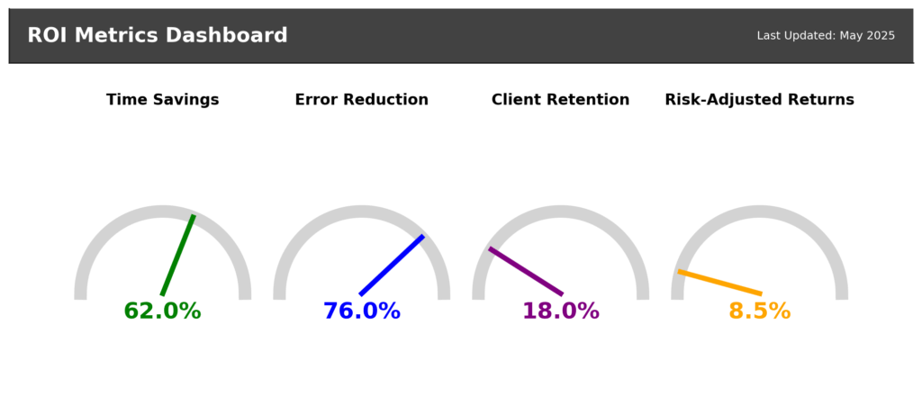
5. How do organizations measure ROI from dashboard implementations? Leading organizations assess dashboard ROI through multiple metrics: time savings in analysis and reporting (median reduction: 62%), error reduction in client communications (typical improvement: 76%), client retention improvements (average increase: 18%), and decision quality enhancement through quantitative measures like increased risk-adjusted returns (typical range: 5-12% improvement).
6. What security measures are essential for portfolio dashboards? Essential security protocols include: multi-factor authentication, role-based access controls, field-level security for sensitive data, encryption for data in transit and at rest, comprehensive audit logging, and regular penetration testing. Organizations with over $5 billion in AUM typically update security protocols quarterly.
7. How are mobile capabilities changing portfolio management dashboards? Mobile optimization has progressed from simple responsive designs to purpose-built mobile experiences. According to Cerulli Associates, financial advisors accessing mobile-optimized dashboards interact with portfolio data 4.7 times more frequently than those limited to desktop platforms, leading to 23% faster response times during market events.
8. What data governance frameworks best support dashboard implementations? Effective data governance for dashboards includes: clear data ownership assignments (by data domain), established quality metrics and thresholds, automated reconciliation processes, exception handling protocols, refresh schedule management, and formal review cycles. Organizations should document these frameworks before dashboard development begins.
9. How are alternative data sources being incorporated into portfolio dashboards? Leading dashboard implementations are integrating alternative data through specialized visualization modules. Current adoption rates show satellite imagery (26% of advanced dashboard systems), social media sentiment analysis (42%), supply chain disruption metrics (37%), and ESG controversy tracking (68%) as the most widely implemented alternative data visualizations.
10. What skills are required to maximize dashboard utilization? Organizations report that dashboard proficiency requires three skill dimensions: technical understanding (ability to navigate interfaces and customize views), analytical capability (skill in interpreting visualizations and identifying meaningful patterns), and communication aptitude (talent for translating visual insights into client narratives). Comprehensive training programs address all three dimensions.
Conclusion
Portfolio management dashboards have transformed from optional visualization tools into mission-critical infrastructure for financial professionals managing significant assets. As markets grow increasingly complex and clients demand greater transparency, these sophisticated interfaces provide the visual intelligence necessary to identify opportunities, mitigate risks, and communicate effectively across stakeholder groups. Organizations that master dashboard implementation gain measurable advantages in decision quality, operational efficiency, and client satisfaction.
Looking ahead, the evolution of dashboard technology will continue accelerating as artificial intelligence, natural language processing, and alternative data integration expand the boundaries of what’s possible. Financial professionals who develop proficiency with these advanced visualization systems will maintain critical advantages in an increasingly data-driven industry landscape.
The future belongs to those who can not only access vast quantities of financial information but can transform that information into visual insights that drive superior decision-making and client outcomes.
For your reference, recently published articles include:
- Portfolio Rebalancing Automation: The Smart Investor’s Edge
- Investing Myths Debunked: Stop Losing Money Now
- Future-Proof Your Portfolio: Surprising Benefits Of Impact Investing
- Seize The Moment: 7 Market Timing Tools For Strategic Wealth
- Investment Pattern Recognition – All You Need To Know
- Never Miss A Rally Again: Ultimate Market Signal Detection
………………………………………………..
Important Notice: The information in this article is for general and public information purposes only. It solely reflects Didi Somm’s or his Staff’s opinion, and no responsibility can be assumed for errors or omissions in the service’s contents. For details, please check the Disclaimer at the bottom of the homepage.

