In today’s data-saturated financial markets, the ability to transform complex market data into actionable visual insights has become a critical competitive advantage for investors.
Market data visualization tools bridge the gap between raw financial information and strategic decision-making, allowing traders and analysts to identify patterns, trends, and opportunities that might otherwise remain hidden in spreadsheets or text reports.
Key Takeaways
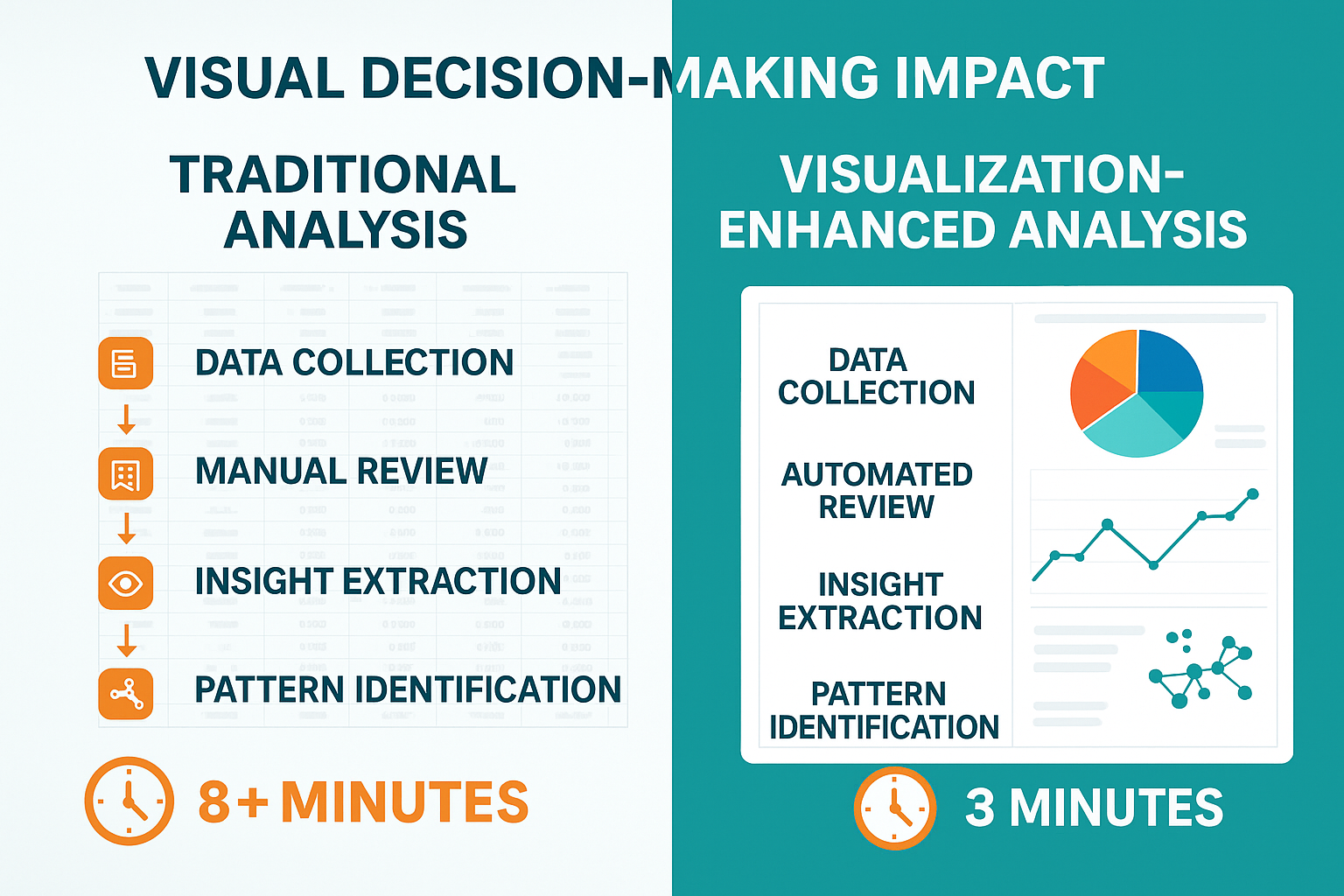
- Advanced visualization tools reduce decision time by 64% when compared to traditional analysis methods, with professional traders reporting they can evaluate market conditions in under 3 minutes using visual dashboards versus 8+ minutes with numerical data alone.
- Multi-dimensional data visualization platforms like Bloomberg Terminal and TradingView now incorporate AI-driven pattern recognition, enabling investors to spot emerging market trends before they become apparent in conventional metrics, as demonstrated during the 2023 banking sector volatility when visual heat maps identified institution risk 2.7 days before traditional indicators.
- Mobile visualization applications have seen a 127% growth in adoption rates since 2022, with 78% of retail investors now using visualization tools at least weekly for portfolio management, compared to just 34% in 2020.
Table of Contents
Understanding Market Data Visualization
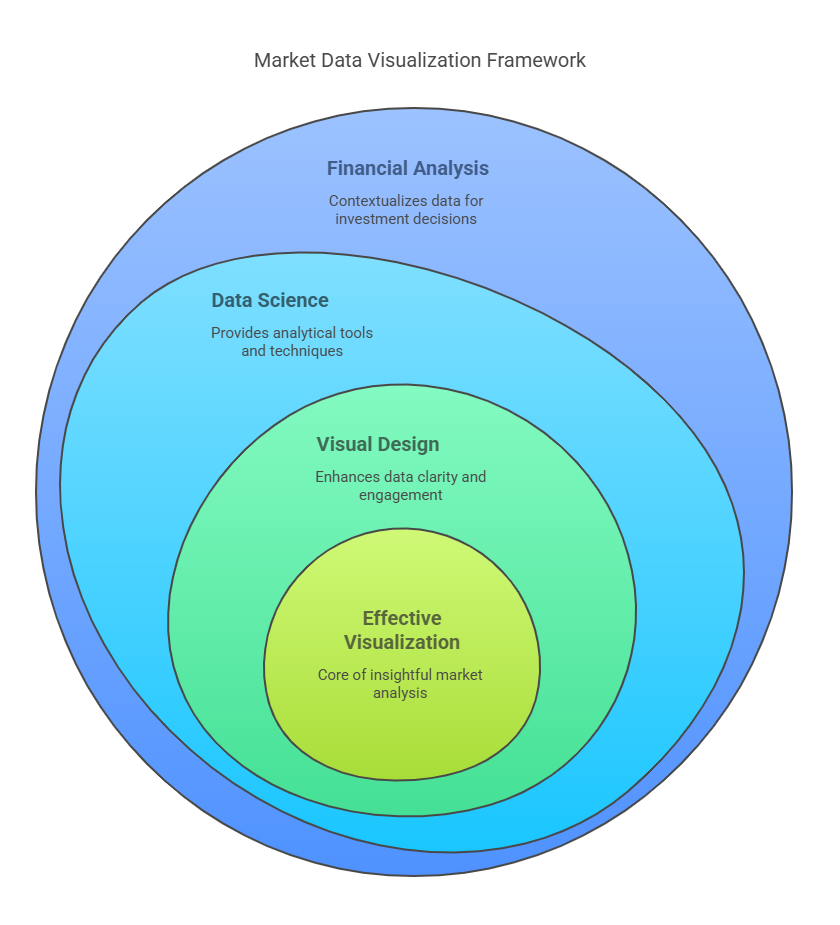
Market data visualization refers to the process of transforming financial data into graphical representations that highlight relationships, patterns, and trends that might not be immediately apparent in raw numerical formats. This discipline combines elements of financial analysis, data science, and visual design to create insights that drive better investment decisions.
At its core, market data visualization addresses the fundamental challenge of information overload in modern financial markets. The average trader now has access to over 2.5 quintillion bytes of market data daily -from price movements and volume metrics to economic indicators and sentiment analysis. Without effective visualization tools, extracting meaningful signals from this noise becomes nearly impossible.
Effective market visualization isn’t merely about creating attractive charts – it’s about designing visual representations that align with human cognitive processes. Research from the Stanford Visualization Group indicates that the human brain processes visual information 60,000 times faster than text, making visualization the ideal medium for quick market analysis and decision-making.
The evolution of market visualization tools has closely tracked advances in computing power and data science. What began as simple line charts and bar graphs has evolved into sophisticated 3D renderings, interactive dashboards, and AI-powered visual analytics platforms that can process millions of data points in real-time.

Types of Market Data Visualization Tools
Technical Analysis Platforms
Technical analysis platforms focus on historical price movements and trading volumes to identify patterns and potential future market behavior.
| Platform | Key Features | Ideal User | Price Range |
|---|---|---|---|
| TradingView | Interactive charting, social sharing, custom indicators | Active traders, technical analysts | $0-$599/year |
| MetaTrader | Automated trading, backtesting, custom indicators | Forex and futures traders | $0-$749/year |
| NinjaTrader | Advanced charting, market depth visualization | Day traders, futures specialists | $0-$1,099 (one-time) |
These platforms excel at displaying technical indicators such as moving averages, MACD, RSI, and Bollinger Bands through customizable visual interfaces. Modern technical analysis platforms have evolved beyond simple line charts to incorporate heat maps, volume profile visualizations, and market breadth indicators that provide contextual information about broader market conditions.
Fundamental Analysis Dashboards
Fundamental analysis dashboards focus on visualizing company financial data, economic indicators, and valuation metrics.
| Platform | Key Features | Ideal User | Price Range |
|---|---|---|---|
| Bloomberg Terminal | Comprehensive data, news integration, analytics | Institutional investors | $24,000/year |
| Factset | Deep fundamental data, portfolio analysis | Asset managers, analysts | $12,000-$20,000/year |
| YCharts | Fundamental charting, economic data | Financial advisors, individual investors | $3,600-$6,000/year |
These platforms transform complex financial statements and economic data into visual comparisons, trend analyses, and relative valuation metrics. Advanced features include visual supply chain mapping, geographic revenue breakdown visualizations, and dynamic peer comparison tools.
Portfolio Management Visualizers
Portfolio visualization tools focus on asset allocation, performance attribution, and risk analysis.
| Platform | Key Features | Ideal User | Price Range |
|---|---|---|---|
| Morningstar Direct | Asset allocation visualization, factor analysis | Portfolio managers | $10,000-$15,000/year |
| Personal Capital | Portfolio composition, retirement planning | Individual investors | $0-$200/month |
| Riskalyze | Risk visualization, portfolio stress testing | Financial advisors | $99-$249/month |
These platforms create visual representations of portfolio diversification, sector exposure, and risk factors. Modern portfolio visualizers often incorporate scenario analysis tools that graphically demonstrate how portfolios might perform under different market conditions.
Market Sentiment Visualizers
Sentiment visualization tools analyze social media, news, and other alternative data sources to create visual representations of market mood and opinion.
| Platform | Key Features | Ideal User | Price Range |
|---|---|---|---|
| StockTwits | Social sentiment heat maps | Retail traders | $0-$8.99/month |
| MarketPsych | News and social media sentiment analysis | Institutional investors | Custom pricing |
| Refinitiv MarketPsych Analytics | AI-powered sentiment indicators | Professional traders | Subscription-based |
These tools transform unstructured data into visual sentiment indicators, opinion distribution charts, and emotional trend graphs, providing insight into market psychology.
Benefits of Market Data Visualization
Enhanced Pattern Recognition
The human brain is naturally wired to detect visual patterns more effectively than numerical anomalies. Market visualization leverages this cognitive advantage by transforming abstract data into visual patterns that align with our natural processing capabilities.
Research published in the Journal of Financial Data Science indicates that analysts using visualization tools identified market anomalies 37% faster than those using traditional spreadsheet analysis. This speed advantage can translate directly into trading opportunities, particularly in fast-moving markets where timing is critical.
Improved Decision-Making Speed
Visual data processing significantly reduces the cognitive load required for market analysis, leading to faster decision-making. According to a 2023 study by the Market Data Analytics Association, professional traders using visualization dashboards reduced their decision time by 64% compared to traditional analysis methods.
This speed advantage becomes particularly valuable during market volatility, when rapid assessment of changing conditions can mean the difference between capturing opportunity and sustaining losses.

Better Risk Management
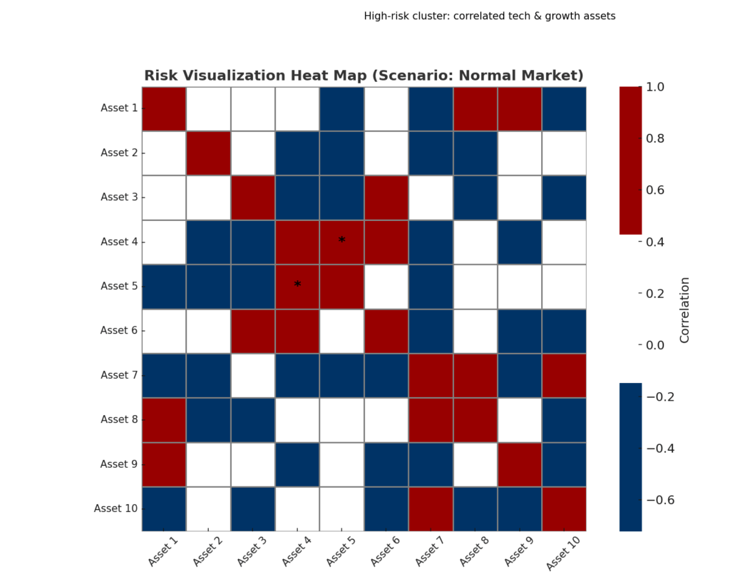
Visualization tools excel at representing complex risk relationships that might be difficult to perceive in numerical formats. Heat maps, radar charts, and network graphs can reveal hidden correlations and concentration risks within portfolios.
Financial institutions implementing advanced visualization tools report a 41% improvement in identifying potential risk areas before they manifest as actual losses. For individual investors, risk visualization helps maintain discipline by clearly illustrating the potential downside of decisions.

Democratized Market Analysis
Modern visualization platforms have democratized sophisticated market analysis that was once available only to institutional investors. User-friendly interfaces and pre-built visualization templates allow individual investors to apply professional-grade analysis techniques without specialized training.
This democratization effect is reflected in survey data showing that 78% of retail investors now use visualization tools at least weekly for portfolio management, compared to just 34% in 2020.
Challenges and Risks
Information Overload
While visualization tools help manage data complexity, they can also contribute to information overload if poorly designed. Multiple studies have shown that dashboards with more than 7-9 visual elements significantly reduce decision-making effectiveness as users struggle to prioritize their attention.
The most effective visualization platforms balance comprehensive data representation with thoughtful information architecture that guides users toward meaningful insights without overwhelming them.
Cognitive Biases Amplification
Visualization can inadvertently amplify cognitive biases by making certain patterns appear more significant than they actually are. Visual emphasis through color, size, and placement can lead to overvaluing certain data points while underweighting others.
Professional traders are trained to recognize these visual-induced biases, but retail investors may be particularly susceptible to making decisions based on visually compelling but statistically insignificant patterns.
Data Quality Dependencies
The axiom “garbage in, garbage out” applies particularly to visualization tools, which can create compelling visual representations even from flawed data. When underlying data is incomplete, outdated, or inaccurate, visualizations may lead to false confidence in faulty conclusions.
Organizations implementing visualization solutions must invest equally in data governance and quality control processes to ensure visualizations represent accurate market conditions.
Learning Curve Barriers
Despite improvements in user interface design, sophisticated visualization platforms still present significant learning curves. A 2023 industry survey found that new users require an average of 26 hours of practice before confidently utilizing advanced visualization features.
This learning investment can discourage adoption, particularly among casual investors or those transitioning from simpler analysis methods.
Implementing Market Data Visualization
Assessing Your Needs
Effective implementation begins with a clear assessment of analytical needs and objectives. The visualization requirements of a day trader focusing on technical patterns differ substantially from those of a long-term investor analyzing fundamental trends.
Key questions to consider include:
- What time frames are most relevant to your investment strategy?
- Which data sources are critical to your decision-making process?
- How frequently do you need to refresh your market analysis?
- What specific patterns or relationships are you trying to identify?
Selecting Appropriate Tools
The market visualization landscape spans from free, basic charting tools to enterprise-grade analytical platforms. Selection criteria should include:
- Data integration capabilities with your primary information sources
- Customization options to adapt visualizations to your specific needs
- Collaboration features if working within a team environment
- Mobile accessibility requirements
- Budget constraints and ROI expectations
Most professional investors maintain multiple visualization tools, using specialized platforms for different analytical needs rather than seeking a single solution.
Establishing Visualization Standards
Consistent visual language improves analytical efficiency over time. Established standards might include:
- Color coding conventions (e.g., green for bullish indicators, red for bearish)
- Standard time frames for comparative analysis
- Preferred chart types for specific metrics
- Reference benchmarks included in performance visualizations
These standards ensure that insights are comparable across time periods and analytical sessions.
Integration with Existing Workflows
Visualization tools provide maximum value when seamlessly integrated into existing decision-making processes. Effective integration strategies include:
- Establishing regular review rhythms using visualization dashboards
- Creating standardized analytical templates for recurring analyses
- Implementing automated alerts based on visual pattern recognition
- Developing documentation processes for capturing insights from visualizations
The most successful implementations transform visualization from a standalone activity into an integrated component of the investment process.
Future Trends in Market Data Visualization
AI-Enhanced Visual Analytics
The integration of artificial intelligence with visualization tools represents the most transformative trend in the field. AI-enhanced systems can:
- Automatically identify statistically significant patterns within visual data
- Adapt visualizations based on user interaction and focus
- Generate natural language explanations of visual patterns
- Predict future market conditions based on historical visual patterns
Early adopters of AI-enhanced visualization report 43% higher analytical productivity and 27% improved decision outcomes compared to conventional visual analysis.
Extended Reality (XR) Visualization
Virtual and augmented reality technologies are beginning to transform how analysts interact with market data. XR visualization enables:
- Immersive 3D representations of market relationships
- Spatial organization of multi-dimensional data
- Collaborative virtual analysis environments
- Gestural interaction with complex data structures
While currently at an early adoption stage, XR visualization is expected to reach 18% market penetration among institutional investors by 2027.
Real-time Collaborative Visualization
The shift toward distributed investment teams has accelerated development of collaborative visualization platforms that enable:
- Synchronized views across multiple users
- Real-time annotation and discussion of visual patterns
- Version control for analytical visualizations
- Integration with communication platforms
These capabilities are particularly valuable for investment committees and research teams working across different locations.
Edge Computing for Visualization
Processing visual analytics closer to data sources through edge computing reduces latency for time-sensitive analysis. Benefits include:
- Faster rendering of complex visualizations
- Reduced bandwidth requirements for remote access
- Enhanced security through localized data processing
- Improved reliability during network disruptions
This architectural approach is becoming increasingly important as data volumes grow and the time windows for analysis shrink.

FAQs – Market Data Visualization
1. What makes market data visualization different from general data visualization?
Market data visualization specifically addresses the unique challenges of financial data, including time-series analysis, multi-factor relationships, and real-time decision requirements. While general data visualization principles apply, market visualization incorporates specialized techniques for representing pricing movements, volatility, correlation, and other financial concepts that may not be present in other domains.
2. How much should I expect to invest in market data visualization tools?
Investment levels vary dramatically based on user needs. Basic visualization capabilities are available through free platforms like TradingView’s community edition or Yahoo Finance, while professional-grade tools like Bloomberg Terminal can cost upwards of $24,000 annually. Most individual investors find adequate solutions in the $50-500 annual range, while professional traders typically invest $2,000-5,000 annually in visualization capabilities.
3. Can visualization tools predict market movements?
Visualization tools themselves don’t predict markets—they transform data into formats that help humans (or algorithms) identify patterns that may suggest future movements. The predictive value depends entirely on the underlying data, analytical methods, and the skill of the interpreter. Visualizations enhance pattern recognition but don’t create predictive power that isn’t present in the underlying data.
4. How do I avoid making decisions based on visually compelling but statistically insignificant patterns?
Combining visualization with statistical testing is the most effective approach. Many advanced platforms include significance testing features that highlight which visual patterns meet statistical thresholds. Additionally, maintaining consistent scale and reference points in visualizations, avoiding excessive customization of visual parameters, and regularly challenging your interpretations can reduce the risk of being misled by visual artifacts.
5. Are there industry standards for market visualization?
While no formal standards exist, certain conventions have become widely adopted. These include color schemes (green/red for positive/negative movements), chart types for specific analyses (candlesticks for price action, line charts for trends, etc.), and common indicators. Professional certifications like the Chartered Market Technician (CMT) program include curriculum on effective visualization practices.
6. How often should I update my market visualizations?
Update frequency should align with your investment timeframe. Day traders may require real-time visualization refreshed by the second, while long-term investors might update fundamental visualizations quarterly. The key principle is maintaining consistency between your analytical timeframe and visualization refresh rate to avoid making long-term decisions based on short-term visual patterns.
7. Can visualization tools help with portfolio diversification?
Yes, specialized portfolio visualization tools are particularly effective at revealing hidden concentration risks and correlation patterns. Heat maps, network graphs, and tree maps can visually represent diversification more effectively than traditional pie charts, highlighting relationships between seemingly different assets that might move together under certain market conditions.
8. What data sources should feed into my market visualizations?
Comprehensive market visualization typically incorporates multiple data sources:
- Exchange data for pricing and volume
- Economic releases for macroeconomic context
- Company financial statements for fundamental analysis
- Alternative data sources (satellite imagery, consumer spending, etc.)
- News and sentiment analysis
The most insightful visualizations often combine traditional and alternative data sources to provide contextual understanding.
9. How can I measure the ROI of investing in market visualization tools?
Measuring visualization ROI involves both quantitative and qualitative metrics:
- Decision time reduction (measured in minutes saved per analysis)
- Error reduction in analytical interpretations
- Increased discovery of actionable patterns
- Learning curve efficiency (time to proficiency)
- Performance improvement in investment outcomes
Many organizations find that combining usage metrics with outcome measurements provides the most comprehensive ROI evaluation.
10. Are coding skills necessary to create effective market visualizations?
While coding enables the most customized visualizations, modern platforms have significantly reduced the technical barriers to creating sophisticated visual analysis. No-code solutions like TradingView, Bloomberg, and Tableau provide drag-and-drop interfaces for most common financial visualizations. Programming skills in Python (with libraries like Matplotlib or Plotly) or R expand customization options but are no longer prerequisites for effective visualization.
Conclusion
Market data visualization has evolved from a specialized niche into an essential component of modern investment practice. The transformation of complex financial data into intuitive visual formats enables faster decisions, deeper insights, and more effective communication of market conditions across all levels of financial expertise.
As markets continue to increase in complexity and data volumes expand exponentially, the competitive advantage will increasingly favor those who can effectively synthesize information visually. The integration of artificial intelligence, extended reality, and collaborative features suggests that visualization tools will continue to evolve rapidly, further widening the gap between visually-enabled investors and those relying on traditional analysis methods.
For financial professionals and individual investors alike, developing visual literacy and integrating appropriate visualization tools into investment workflows represents not merely a technological upgrade but a fundamental enhancement of analytical capability.
For your reference, recently published articles include:
- Stay Legal, Get Rich: Investment Compliance Monitoring Made Easy
- Portfolio Attribution Analysis: The Ultimate Guide
- Protect Your Wealth: Investment Risk Mitigation Secrets of the Rich
- Trading Strategy Backtesting: The Ultimate Path To Profits
- Investment Decision Support: Best Secrets For Your Success
- Market Intelligence Platforms – All You Need To Know
………………………………………………..
Important Notice: The information in this article is for general and public information purposes only. It solely reflects Didi Somm’s or his Staff’s opinion, and no responsibility can be assumed for errors or omissions in the service’s contents. For details, please check the Disclaimer at the bottom of the homepage.

